PTApp Component
Complete People Transport Management application with sidebar navigation and responsive design
PTApp Component
A complete People Transport Management application component with sidebar navigation, responsive design, and localization support. PTApp provides a ready-to-use shell for building transportation management applications.
Screenshots
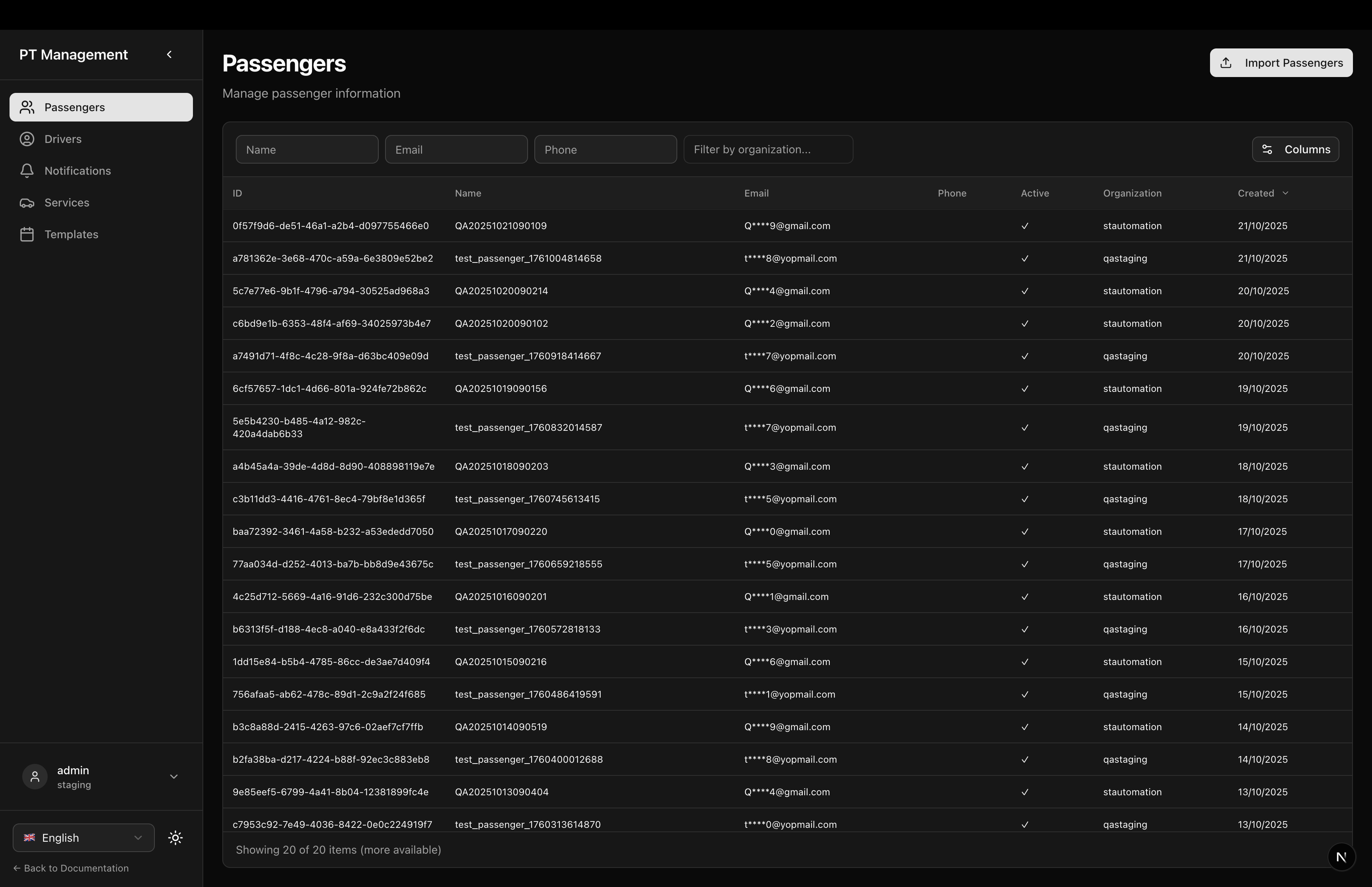
Passengers Page
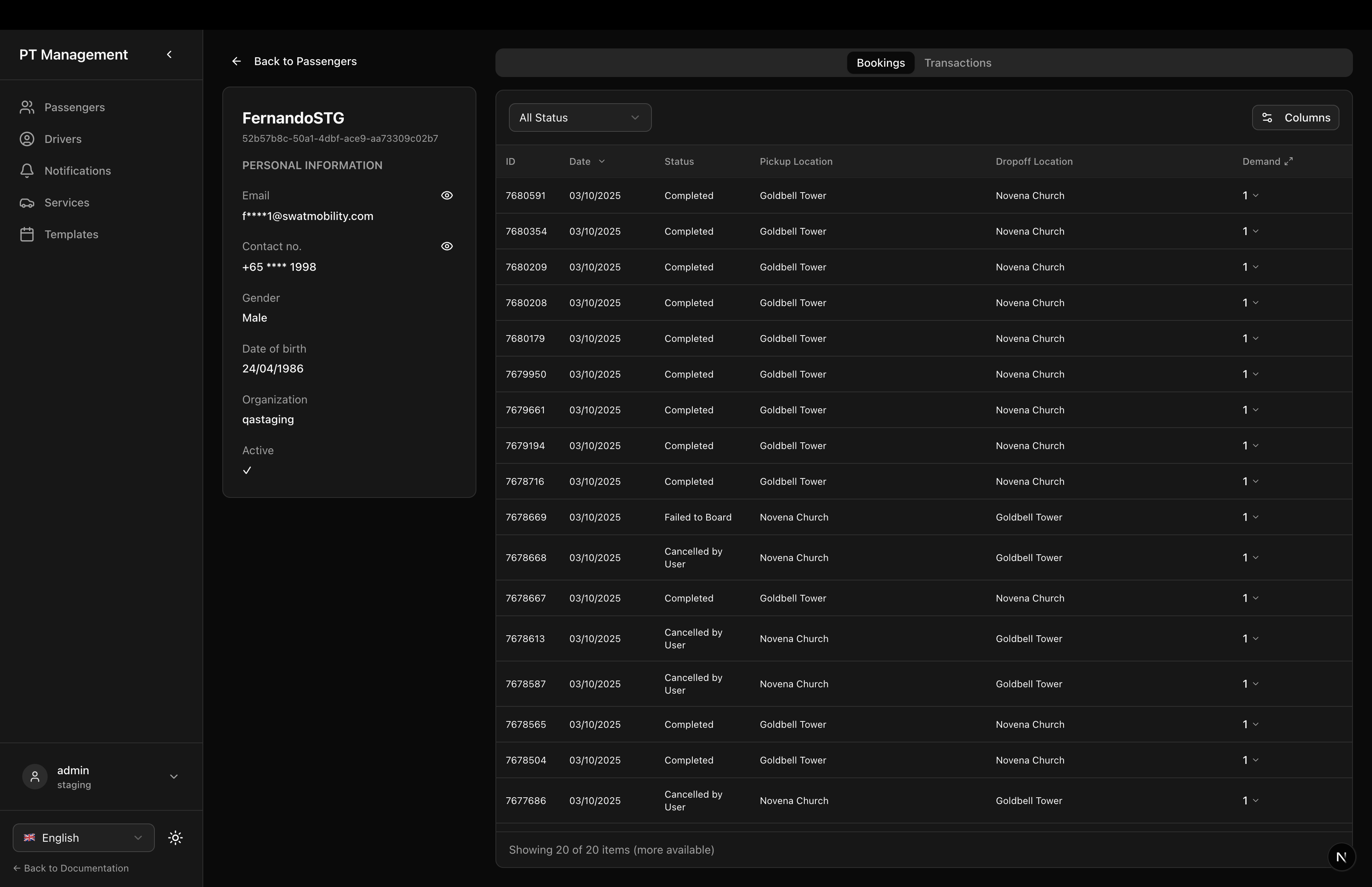
Passenger Detail - Bookings
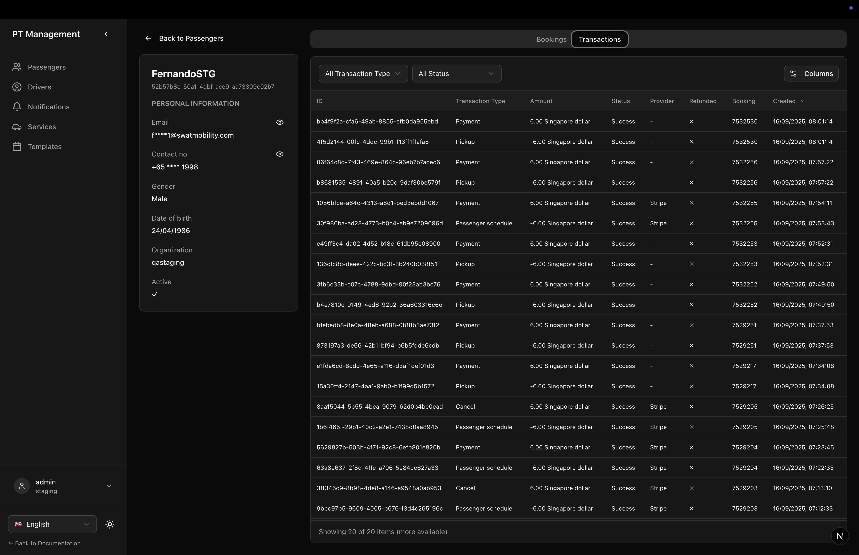
Passenger Detail - Transactions
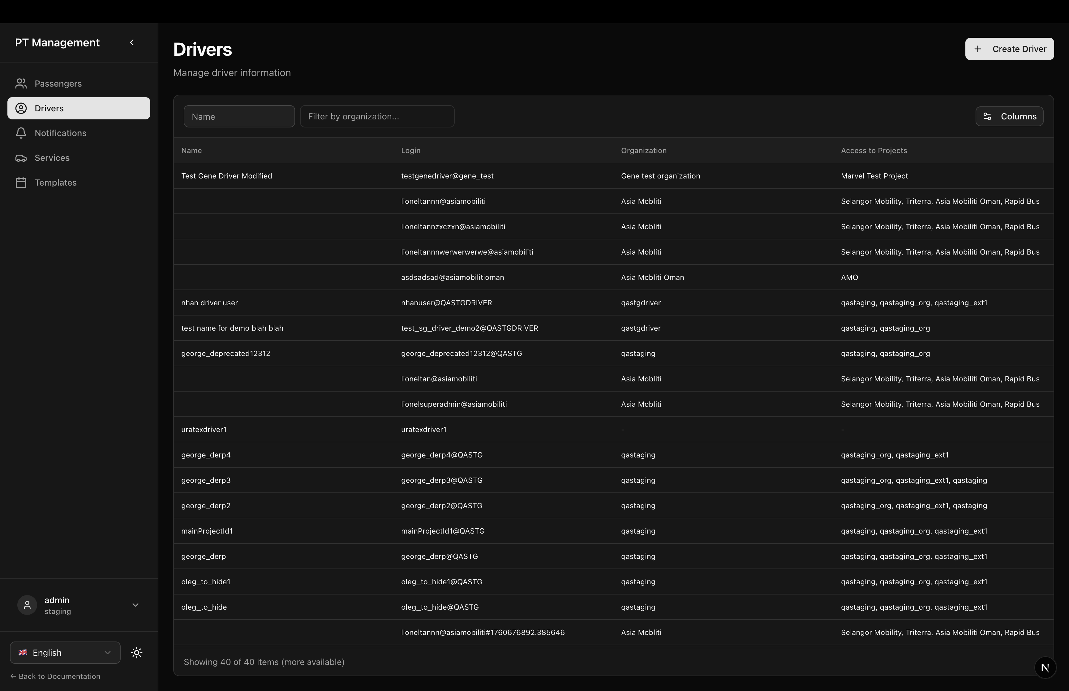
Drivers Page
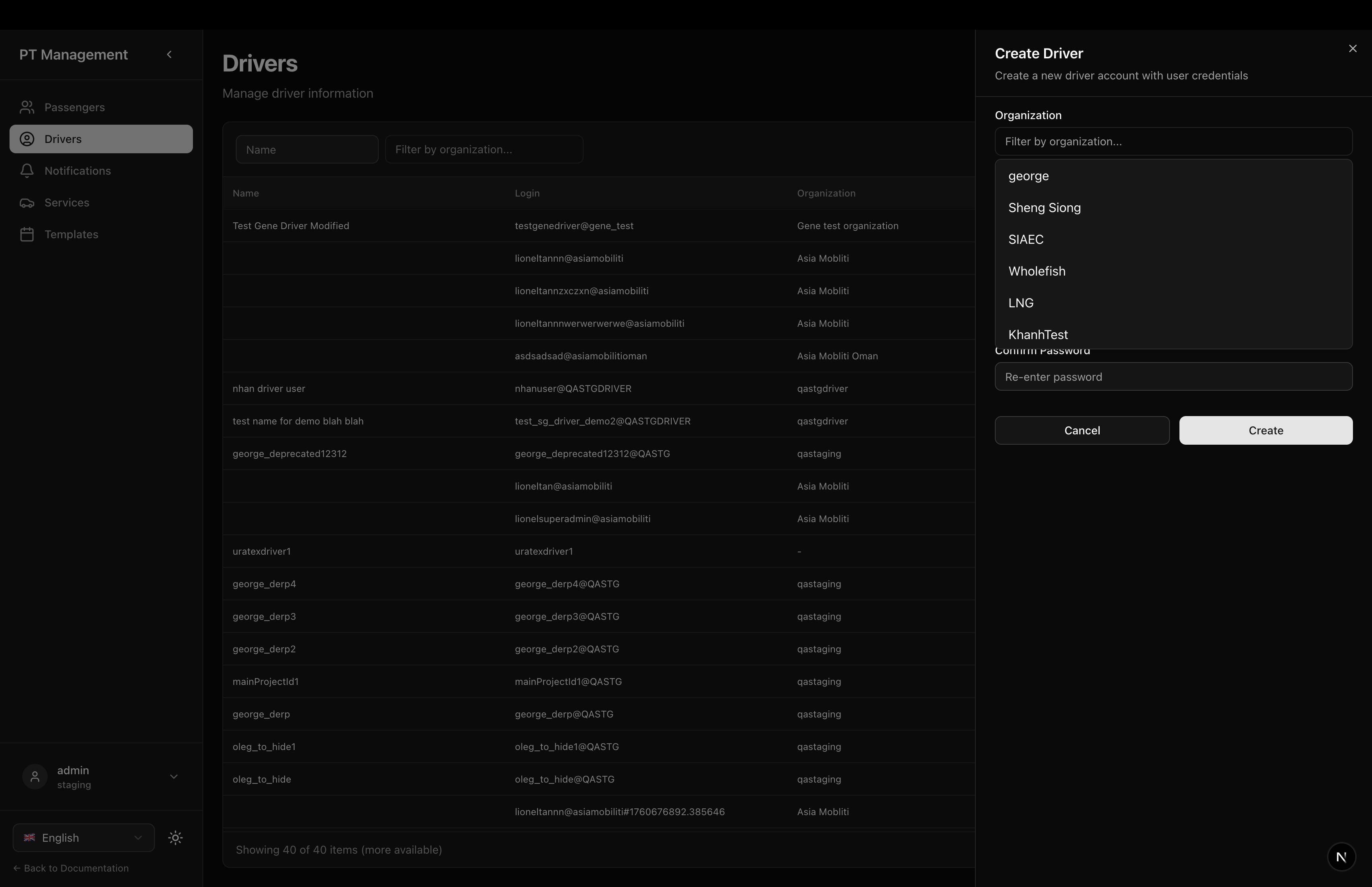
Driver Editor
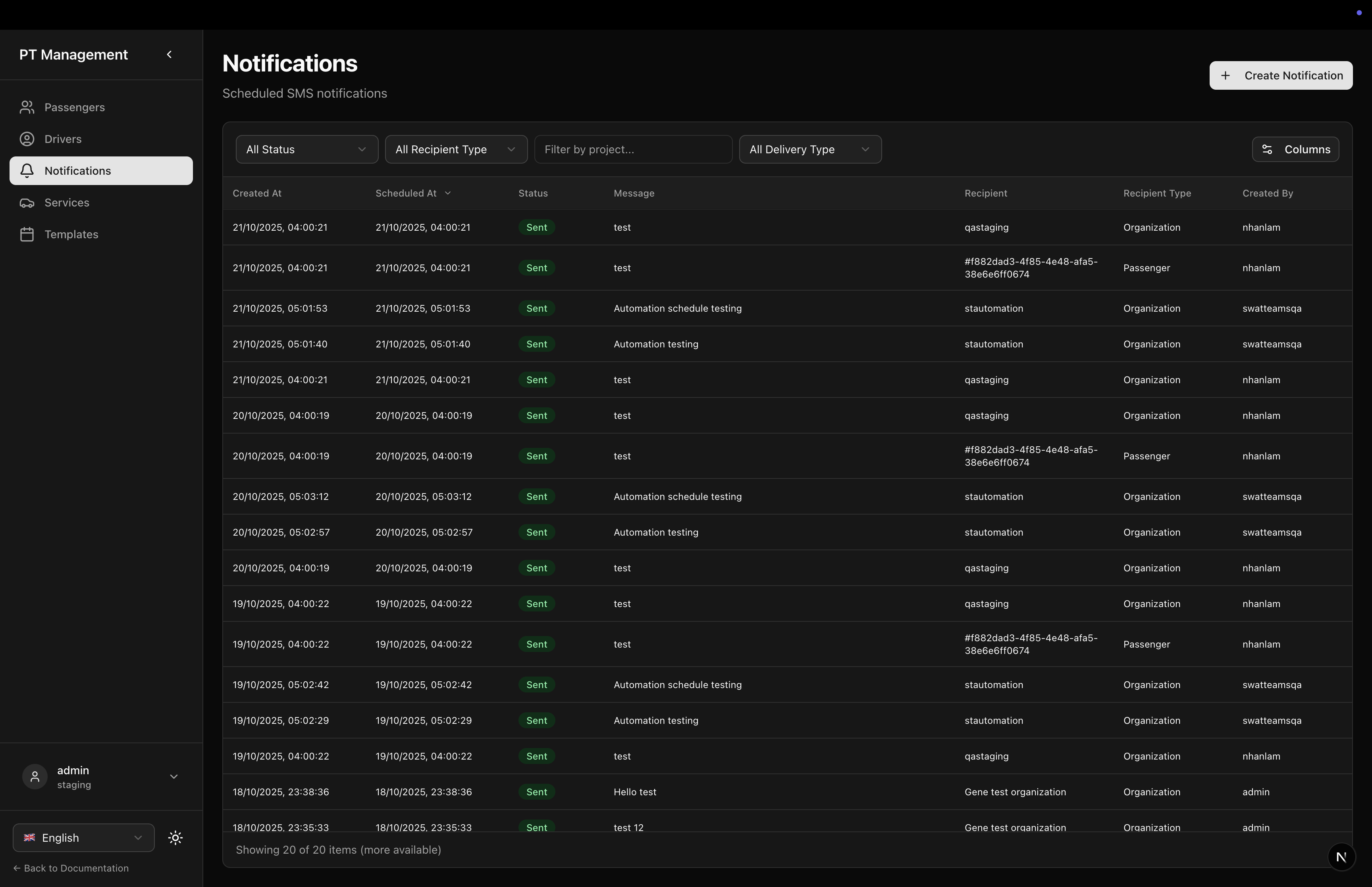
Notifications Page
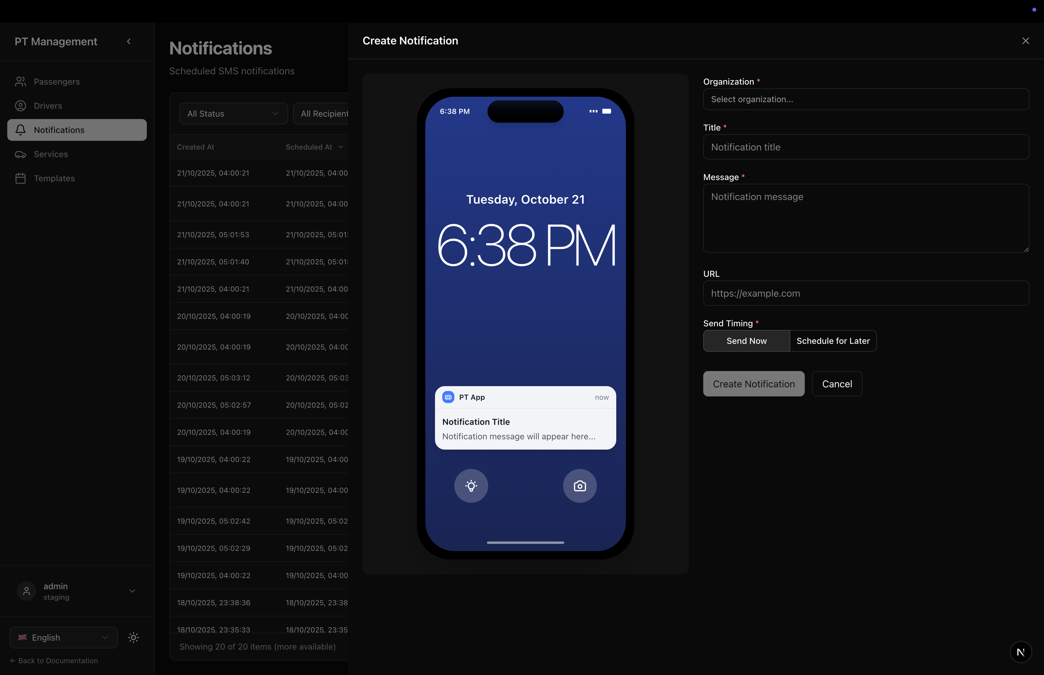
Create Notification
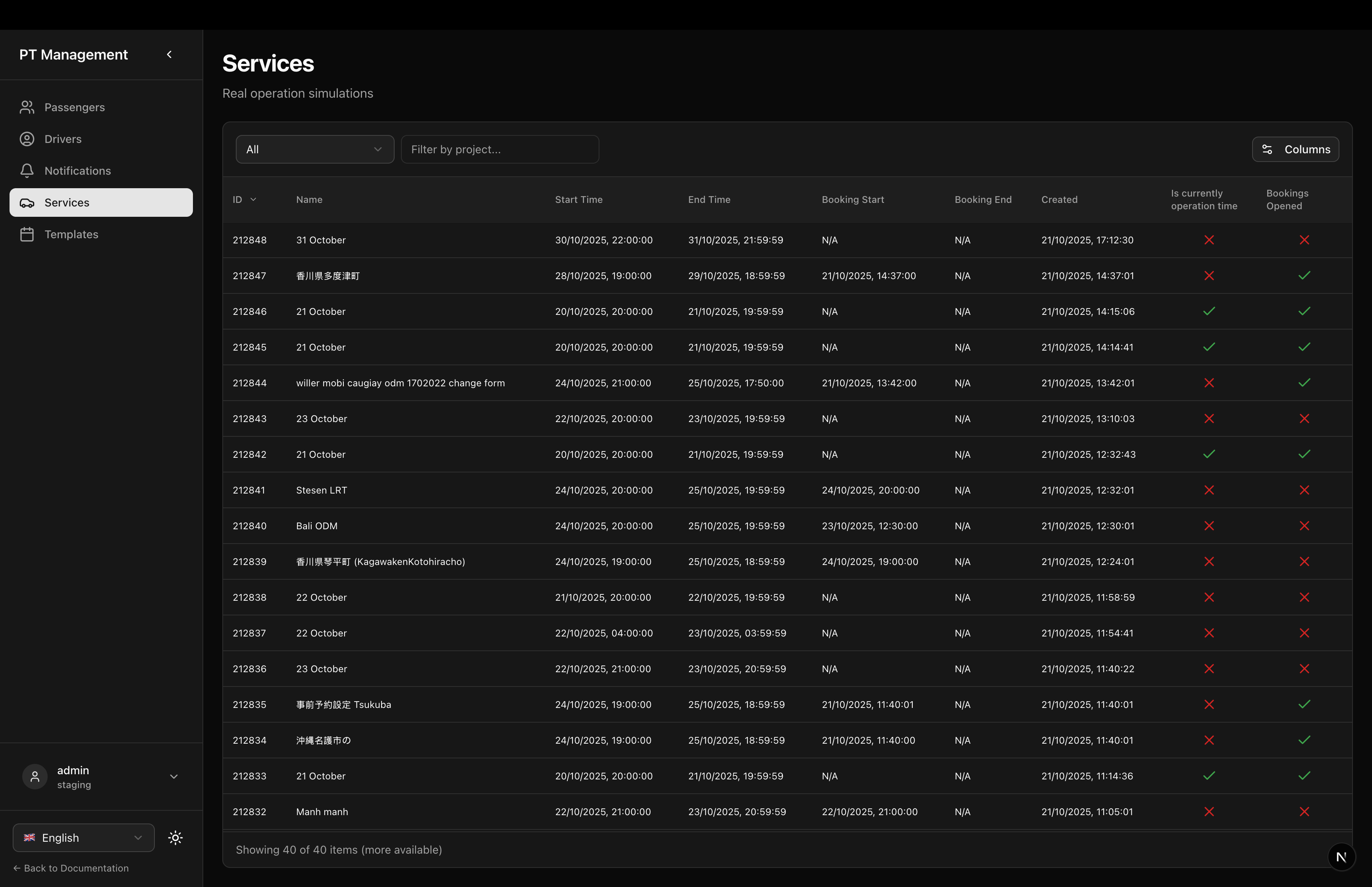
Services Page
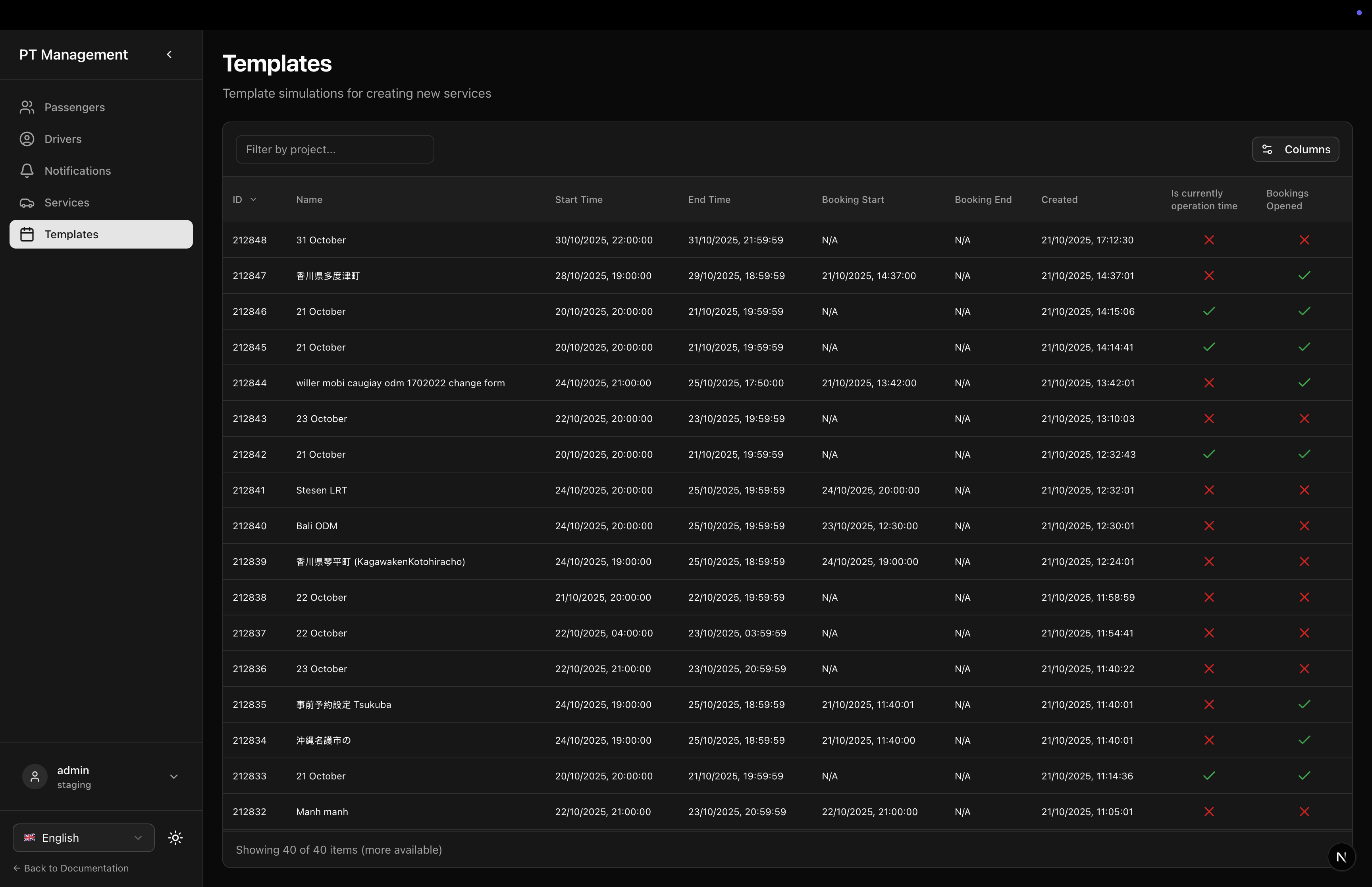
Templates Page
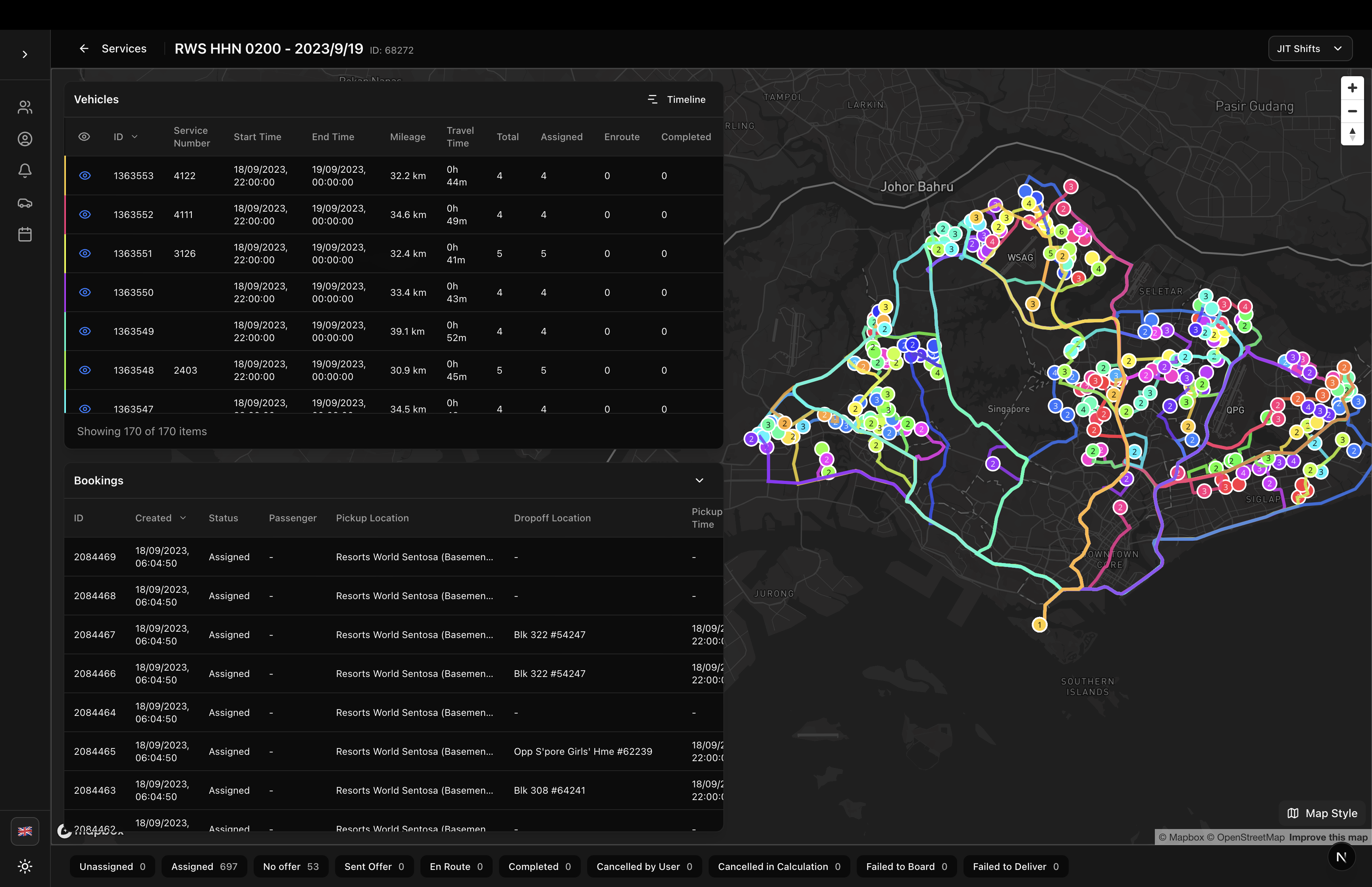
Simulation Detail - All Routes
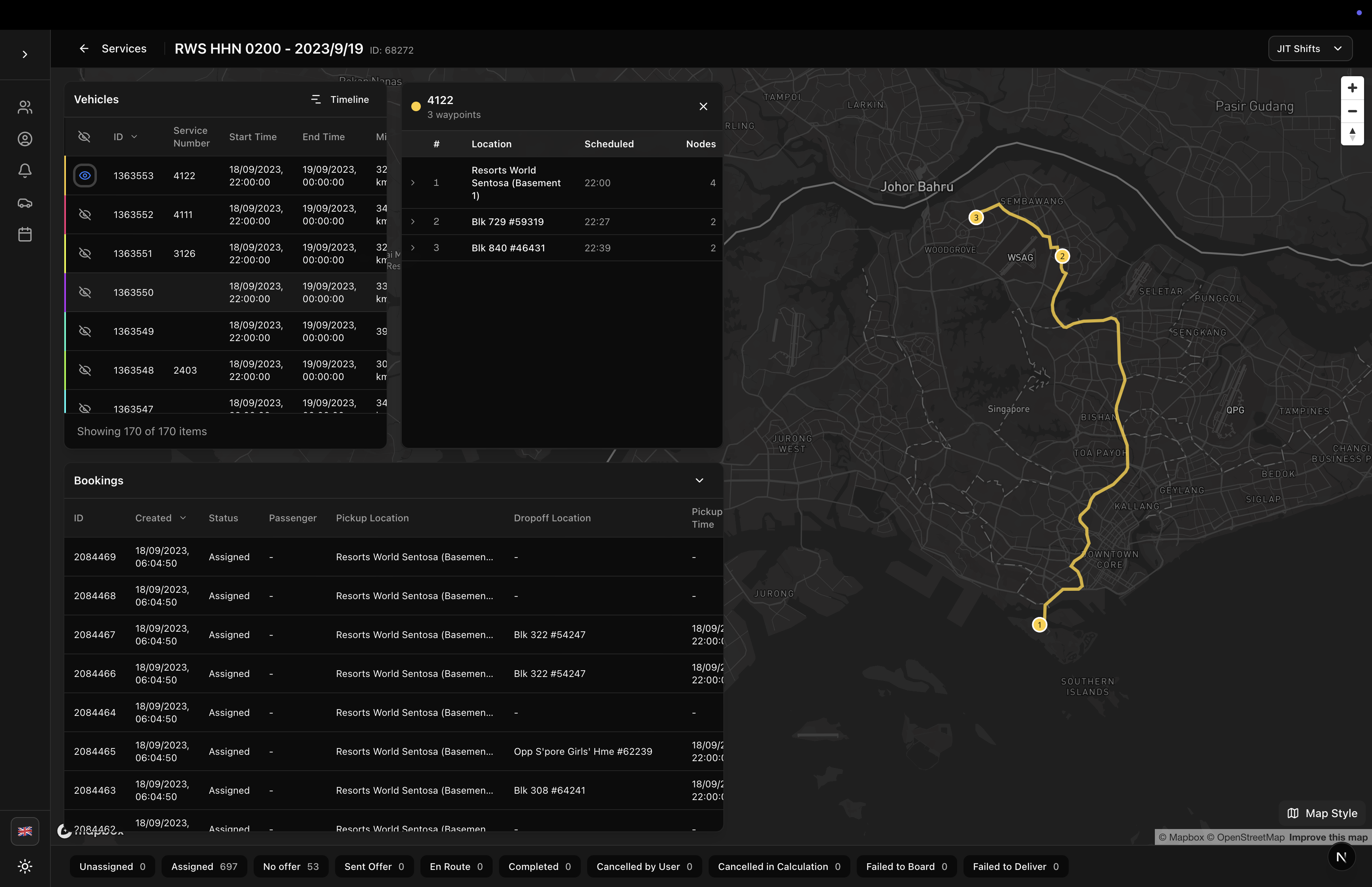
Simulation Detail - Single Route
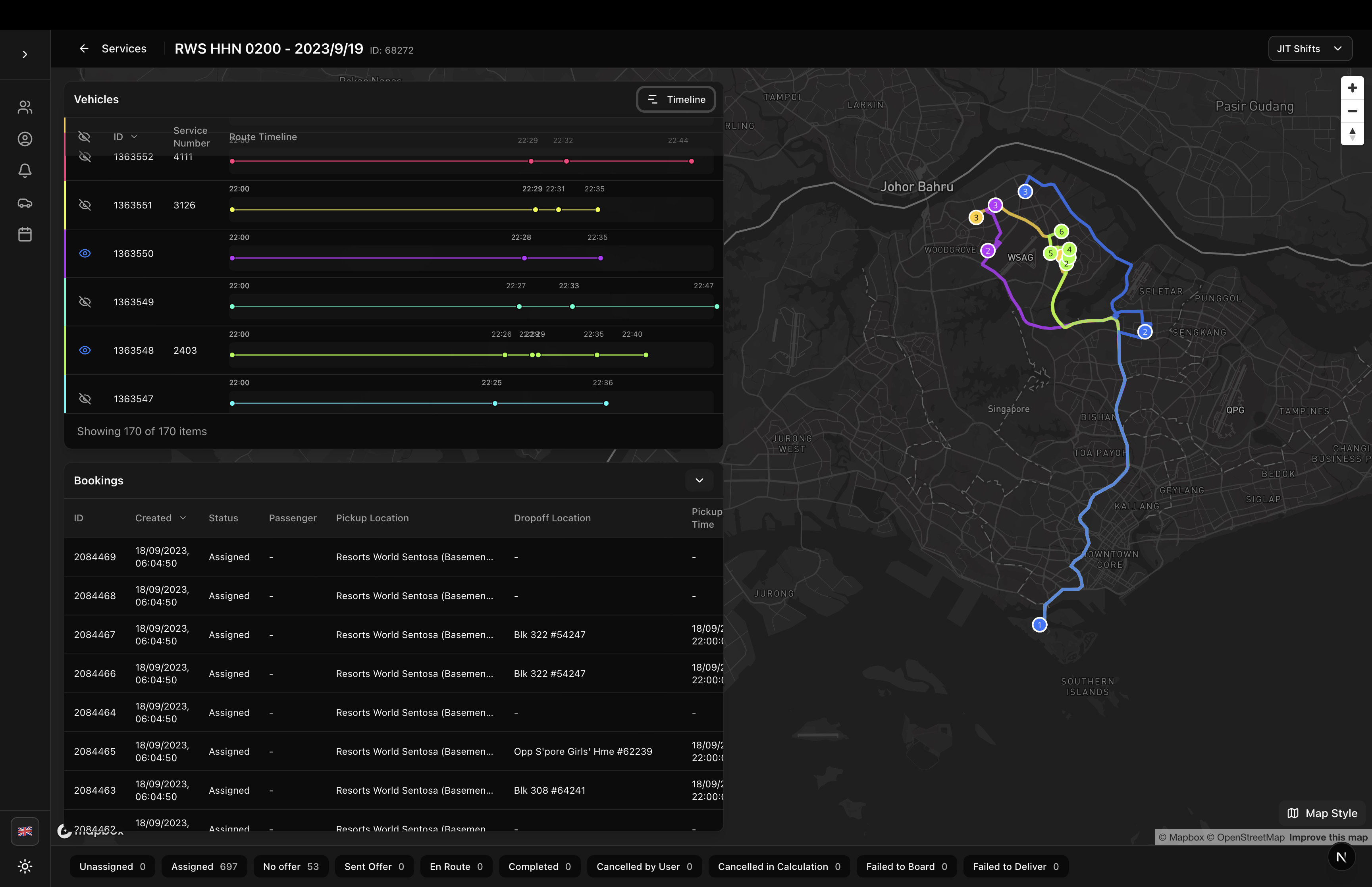
Simulation Detail - Timeline
Features
- Sidebar Navigation: Collapsible sidebar with passenger, driver, notification, service, and template pages
- Responsive Design: Mobile-friendly with hamburger menu and backdrop overlay
- Localization: Fully localized in English and Japanese
- Theme Support: Works with light and dark themes
- Customizable Base Path: Configure your own routing base path
- Persistent UI State: Remembers sidebar collapsed state in localStorage
- Active State Highlighting: Automatically highlights current page in navigation
Installation
The PTApp component is included in the sgerp-frontend-lib package:
npm install sgerp-frontend-lib
Usage
Basic Usage
import { PTApp } from '@/components/sgerp/ptapp';

export default function MyPTApp() {
  return (
    <PTApp>
      {/* Your page content goes here */}
    </PTApp>
  );
}
Custom Base Path
By default, PTApp uses /ptapp as the base path. You can customize it:
import { PTApp } from '@/components/sgerp/ptapp';

export default function MyPTApp() {
  return (
    <PTApp basePath="/transport">
      {/* Navigation will now use /transport, /transport/drivers, etc. */}
    </PTApp>
  );
}
Next.js App Router Example
This is the recommended pattern for Next.js applications:
// app/ptapp/layout.tsx
'use client'

import { PTApp } from '@/components/sgerp/ptapp';

export default function PTAppLayout({
  children,
}: {
  children: React.ReactNode
}) {
  return <PTApp>{children}</PTApp>
}
// app/ptapp/page.tsx
'use client'

import { useSGERP } from 'sgerp-frontend-lib';
import { PassengerTable } from '@/components/sgerp/tables/passenger-table';

export default function PassengersPage() {
  const api = useSGERP();

  return (
    <div className="flex-1 flex flex-col gap-6 min-h-0">
      <div>
        <h1 className="text-3xl font-bold">Passengers</h1>
        <p className="text-muted-foreground mt-2">Manage passenger information</p>
      </div>

      <div className="flex-1 min-h-0">
        <PassengerTable
          collection={api?.collections.passenger ?? null}
          fullscreenHeight
        />
      </div>
    </div>
  );
}
Props
| Prop | Type | Default | Required | Description |
|---|---|---|---|---|
children | React.ReactNode | - | Yes | Page content to render in the main area |
basePath | string | "/ptapp" | No | Base path for navigation routes |
Navigation Pages
The PTApp component includes navigation for these pages:
- Passengers (
/ptapp) - Passenger management and imports - Drivers (
/ptapp/drivers) - Driver management with organization filtering - Notifications (
/ptapp/notifications) - SMS/Push notification scheduling - Services (
/ptapp/services) - Real operation simulations - Templates (
/ptapp/templates) - Template simulations
You need to create these page routes in your application. See the complete example in this repository's /app/ptapp directory.
Layout Structure
The PTApp component provides a three-part layout:
1. Sidebar
- Desktop: Collapsible sidebar (toggle button collapses to icon-only view)
- Mobile: Full overlay with backdrop, hamburger menu to open
- Footer: Language selector, theme toggle, and back to docs link
- User Info: Connection information display
2. Top Bar
- Mobile Menu: Hamburger button to open sidebar (mobile only)
- Page Title: Displays current section title
3. Main Content Area
- Scrollable content area with padding
- Flexible height to fill available space
- Renders the
childrenprop
Features in Detail
Collapsible Sidebar
The sidebar can be collapsed on desktop to show only icons:
- Click the chevron button to toggle
- State persists in localStorage (
ptapp-sidebar-collapsed) - Tooltips shown on hover when collapsed
- Full sidebar on mobile (never collapsed)
Active State
The component automatically highlights the active navigation item based on the current pathname using Next.js usePathname() hook.
Language Selector
Built-in language selector in the sidebar footer allows users to switch between supported languages. Uses the LanguageSelector component from the library.
Theme Toggle
Built-in theme toggle (light/dark mode) in the sidebar footer using the ThemeToggle component.
User Connection Info
Shows currently connected SGERP server and user information in the sidebar footer (when not collapsed).
Complete Implementation Example
Here's how the reference implementation structures the pages:
app/ptapp/
├── layout.tsx                  # PTApp wrapper
├── page.tsx                    # Passengers (default page)
├── drivers/
│   └── page.tsx               # Drivers with DriverTable
├── notifications/
│   └── page.tsx               # Notifications with SMSScheduledTable
├── services/
│   └── page.tsx               # Services (real operations)
└── templates/
    └── page.tsx               # Templates
Example Passengers Page
'use client'

import { useSGERP } from 'sgerp-frontend-lib';
import { PassengerTable } from '@/components/sgerp/tables/passenger-table';
import { useLocalization } from 'sgerp-frontend-lib/lib/locales/useLocalization';

export default function PassengersPage() {
  const api = useSGERP();
  const { getText } = useLocalization();

  return (
    <div className="flex-1 flex flex-col gap-6 min-h-0">
      <div>
        <h1 className="text-3xl font-bold" suppressHydrationWarning>
          {getText('ptapp.passengers.title')}
        </h1>
        <p className="text-muted-foreground mt-2" suppressHydrationWarning>
          {getText('ptapp.passengers.description')}
        </p>
      </div>

      <div className="flex-1 min-h-0">
        <PassengerTable
          collection={api?.collections.passenger ?? null}
          fullscreenHeight
        />
      </div>
    </div>
  );
}
Example Drivers Page
'use client'

import { useState } from 'react';
import { useSGERP } from 'sgerp-frontend-lib';
import { DriverTable } from '@/components/sgerp/tables/driver-table';
import { DriverDrawer } from '@/components/sgerp/driver-drawer';
import { useLocalization } from 'sgerp-frontend-lib/lib/locales/useLocalization';
import { Button } from '@/components/ui/button';
import { Plus } from 'lucide-react';

export default function DriversPage() {
  const api = useSGERP();
  const { getText } = useLocalization();
  const [drawerOpen, setDrawerOpen] = useState(false);
  const [selectedDriverId, setSelectedDriverId] = useState<number | undefined>();

  const handleRowClick = (driver) => {
    setSelectedDriverId(driver.id);
    setDrawerOpen(true);
  };

  return (
    <div className="flex-1 flex flex-col gap-6 min-h-0">
      <div className="flex items-start justify-between">
        <div>
          <h1 className="text-3xl font-bold" suppressHydrationWarning>
            {getText('ptapp.drivers.title')}
          </h1>
          <p className="text-muted-foreground mt-2" suppressHydrationWarning>
            {getText('ptapp.drivers.description')}
          </p>
        </div>
        <Button onClick={() => {
          setSelectedDriverId(undefined);
          setDrawerOpen(true);
        }}>
          <Plus className="h-4 w-4 mr-2" />
          {getText('driver.create_driver')}
        </Button>
      </div>

      <div className="flex-1 min-h-0">
        <DriverTable
          collection={api?.collections.driver ?? null}
          fullscreenHeight
          onRowClick={handleRowClick}
        />
      </div>

      <DriverDrawer
        open={drawerOpen}
        onOpenChange={setDrawerOpen}
        driverId={selectedDriverId}
        api={api}
      />
    </div>
  );
}
Localization
PTApp uses localization keys from sgerplib/locales/:
Navigation Keys
ptapp.title- Sidebar headerptapp.header- Top bar headerptapp.nav.passengers- Passengers nav itemptapp.nav.drivers- Drivers nav itemptapp.nav.notifications- Notifications nav itemptapp.nav.services- Services nav itemptapp.nav.templates- Templates nav itemptapp.back_to_docs- Footer link
Page Title Keys
ptapp.passengers.title/ptapp.passengers.descriptionptapp.drivers.title/ptapp.drivers.descriptionptapp.notifications.title/ptapp.notifications.descriptionptapp.services.title/ptapp.services.descriptionptapp.templates.title/ptapp.templates.description
Styling
The component uses:
- Tailwind CSS for all styling
- shadcn/ui Button component
- Lucide React icons
- CSS transitions for smooth sidebar animation
- Theme-aware colors (works with light/dark themes)
Required CSS Setup
Ensure your project has:
- Tailwind CSS configured
- shadcn/ui components installed
- SGERP theme variables configured
Responsive Behavior
Desktop (≥1024px)
- Sidebar always visible
- Collapsible to icon-only mode
- Toggle button shows chevron icon
Mobile (<1024px)
- Sidebar hidden by default
- Hamburger menu button in top bar
- Full overlay when opened
- Backdrop click closes sidebar
- Close X button in sidebar header
State Management
Sidebar Collapsed State
- Stored in localStorage with key
ptapp-sidebar-collapsed - Loaded synchronously on mount using
useLayoutEffect - Persists across page reloads and sessions
Hydration Handling
- Uses
suppressHydrationWarningon localized elements - Opacity transition prevents layout shift
- Waits for both hydration and locale loading before showing
Dependencies
Required packages:
next(App Router for routing)react(18+)lucide-react(for icons)sgerp-frontend-lib(collections, hooks, components)
Components used:
@/components/ui/button(shadcn/ui)LanguageSelectorfrom sgerp-frontend-libThemeTogglefrom your projectUserConnectionInfofrom sgerp-frontend-lib
Related Components
- DriverTable - Table for driver management
- DriverDrawer - Drawer for driver CRUD
- PassengerTable - Table for passenger management
- SMSScheduledTable - Table for notifications
- LanguageSelector - Language switching component
Full Example
For a complete working example with all pages, navigation, and data management, see the /app/ptapp directory in this repository.