Reusable Page Components
Complete, production-ready page components for transportation management applications
Reusable Page Components
The SGERP Frontend Library includes a set of complete, production-ready page components that can be dropped into any application. These components combine tables, editors, navigation, and business logic into fully functional pages.
Gallery
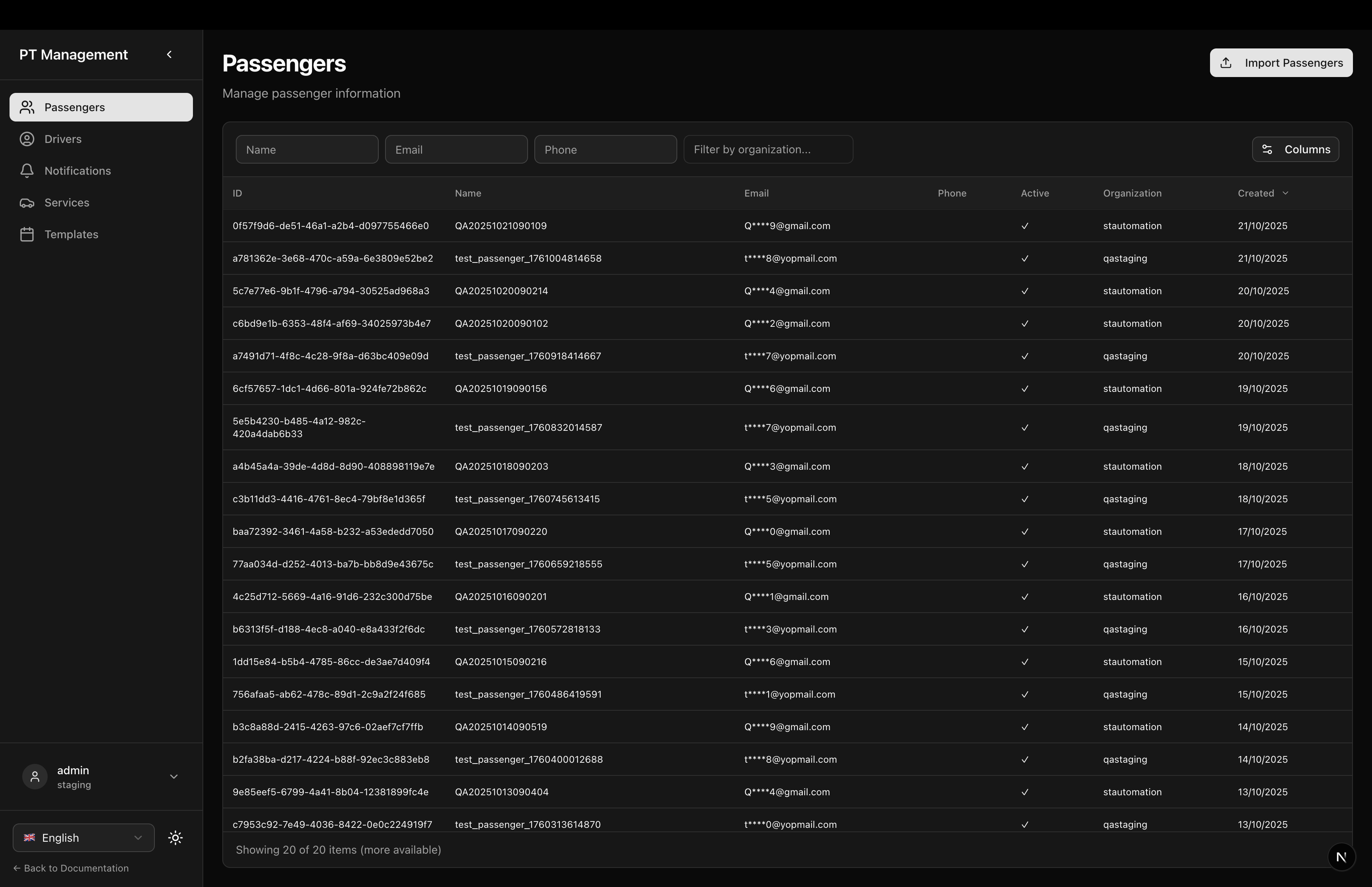
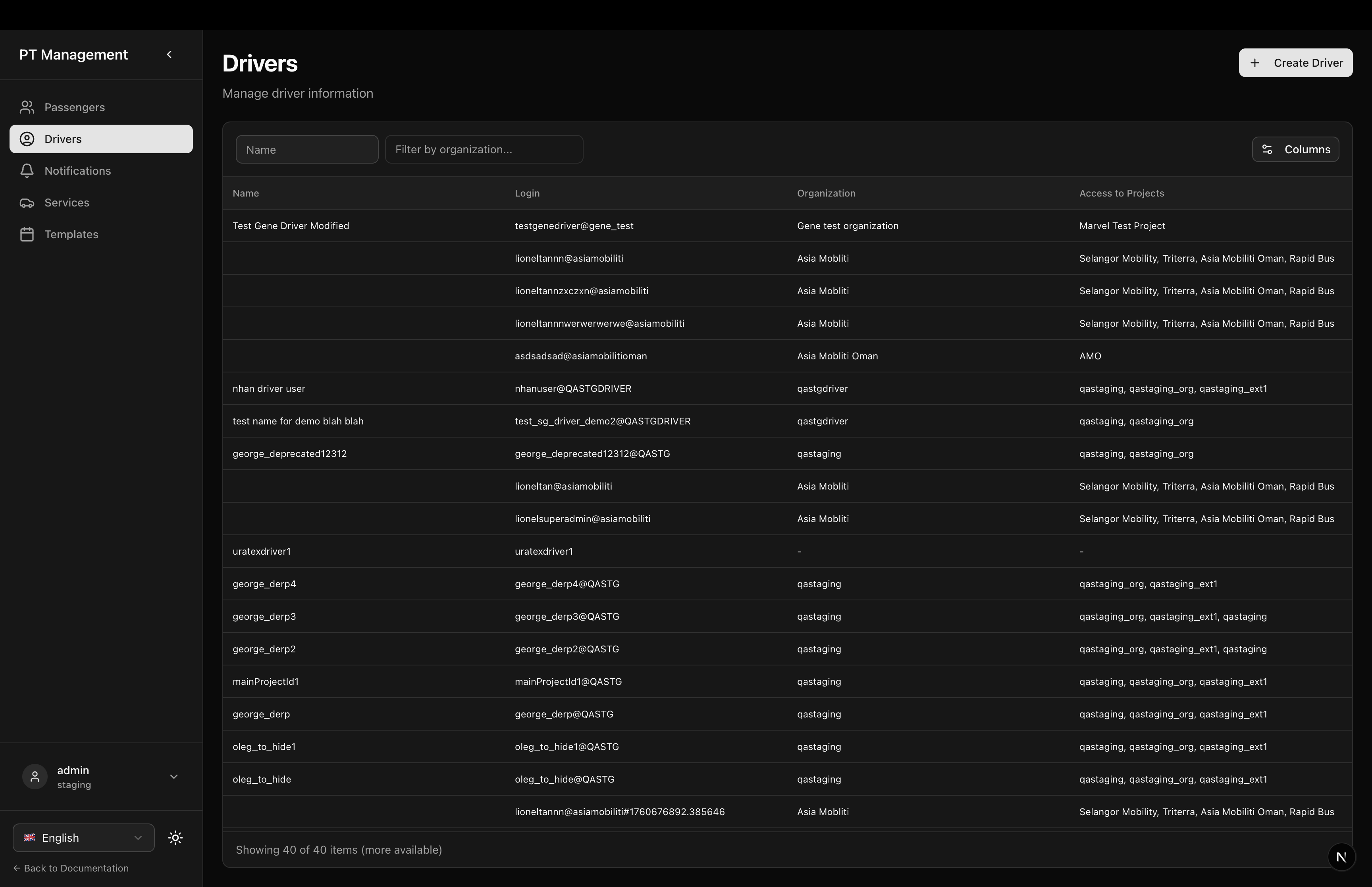
Passengers & Drivers
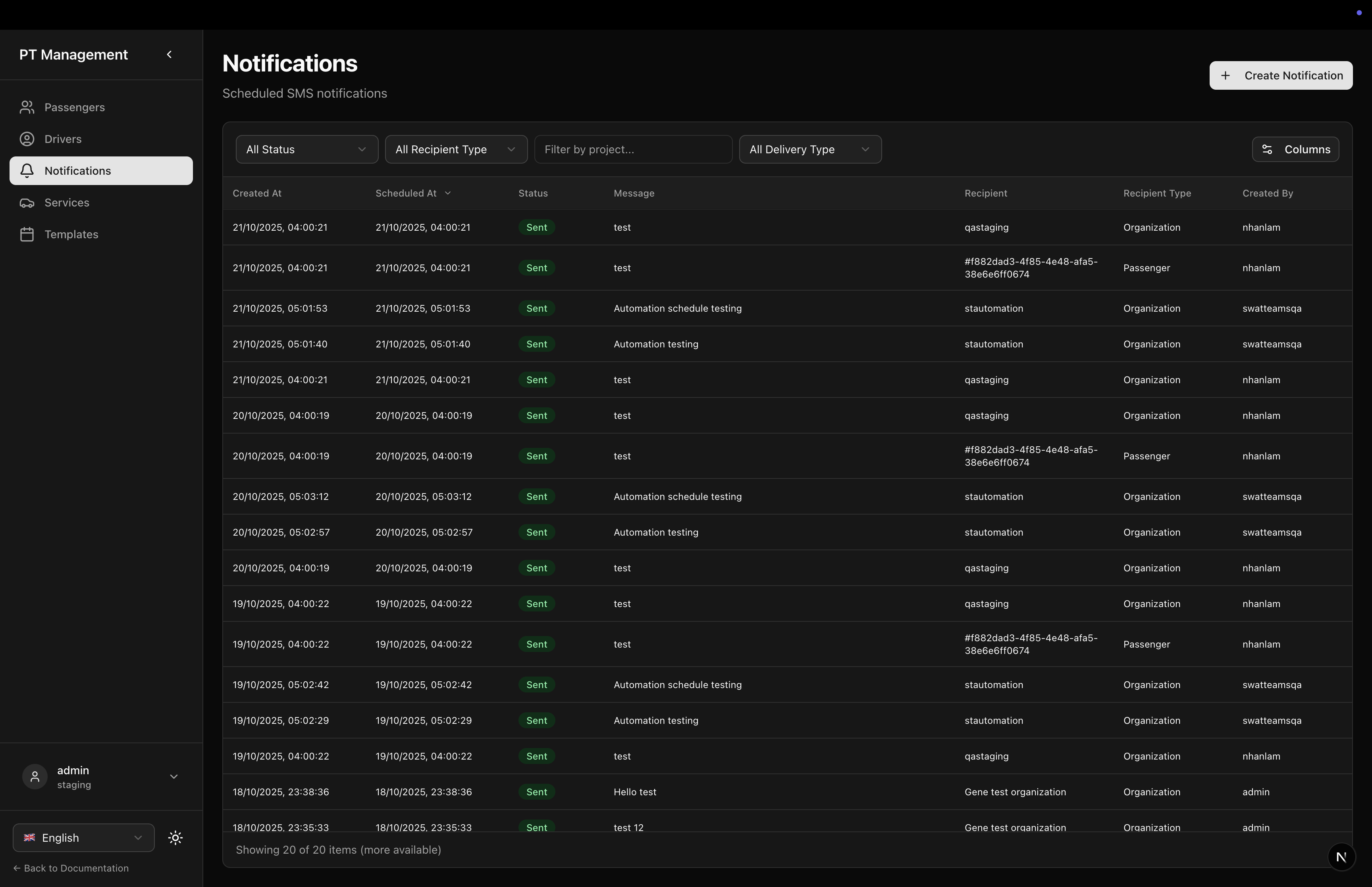
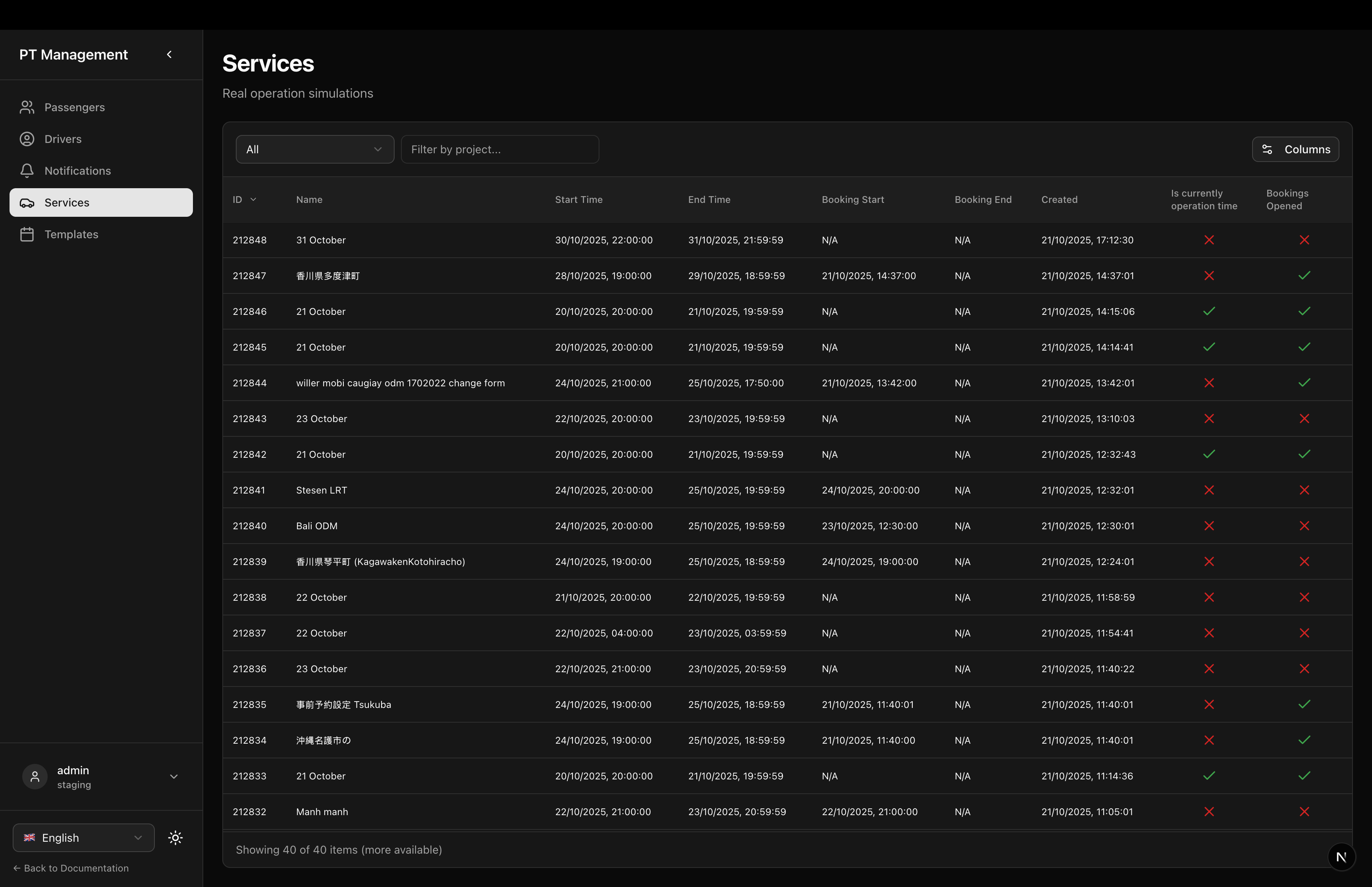
Notifications & Services
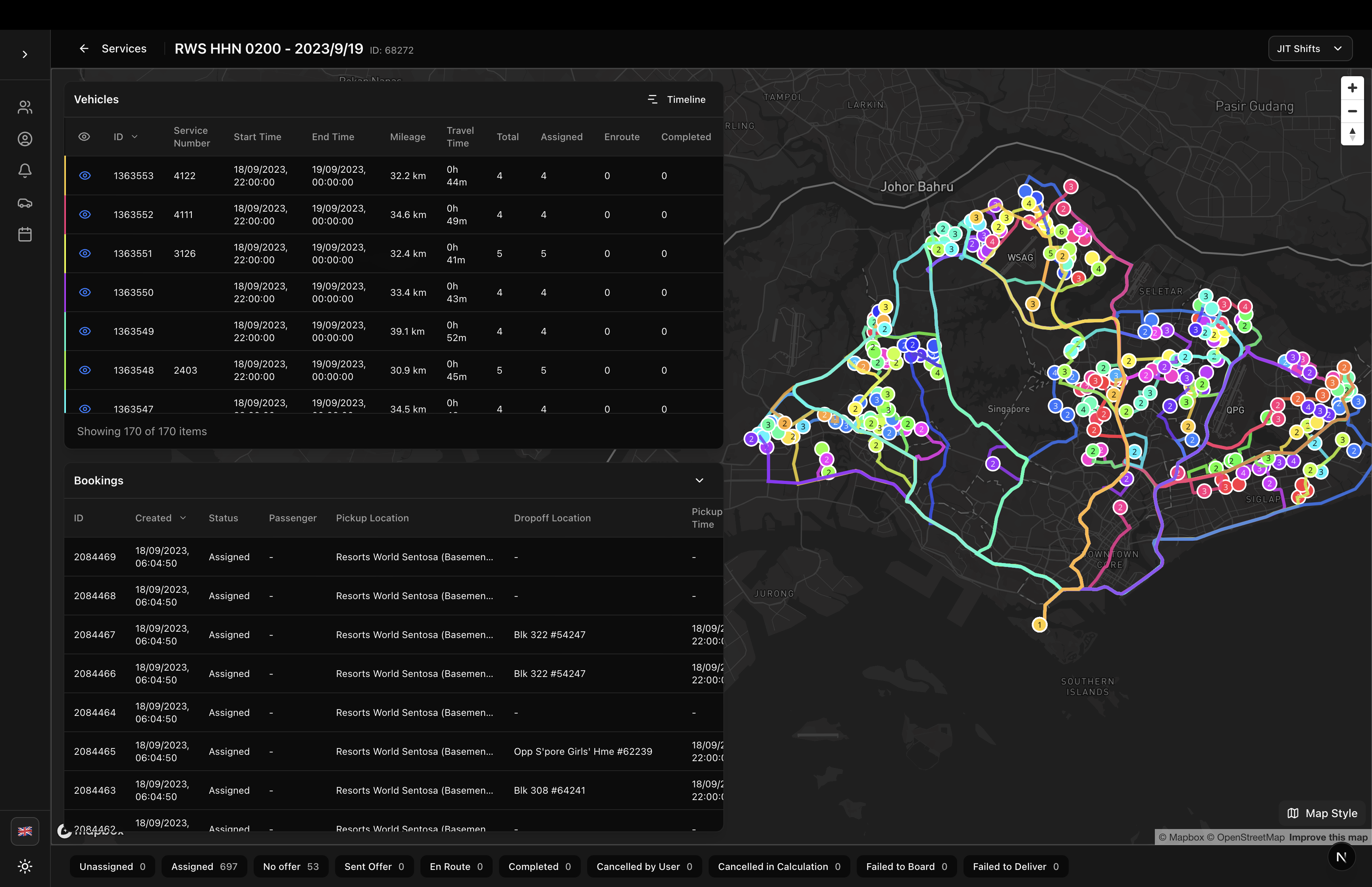
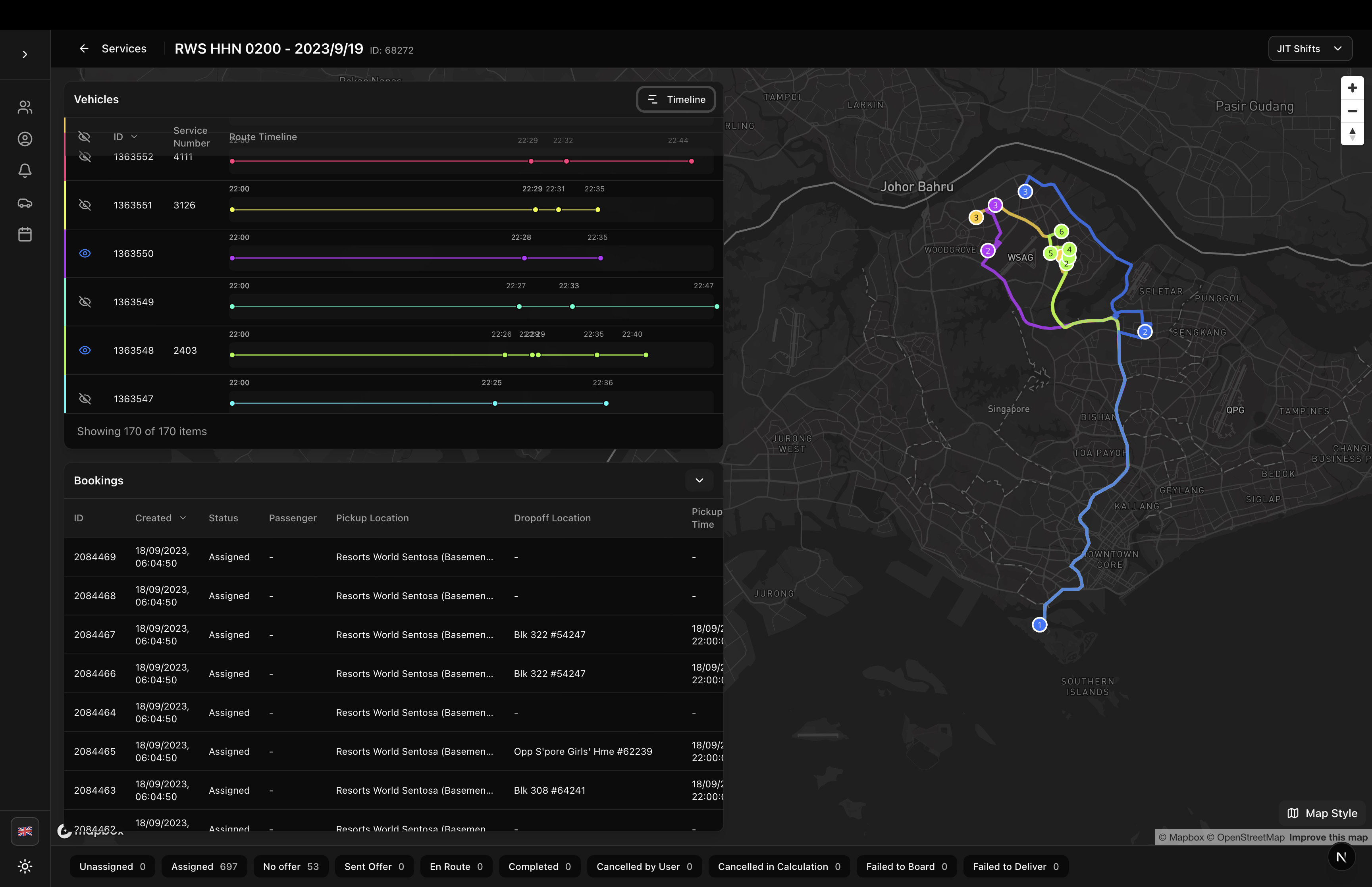
Simulation Detail
All page components are located in components/sgerp/pages/ and can be imported individually:
import {
  SimulationDetailPage,
  ServicesPage,
  TemplatesPage,
  DriversPage,
  NotificationsPage,
  PassengersPage,
  PassengerDetailPage
} from '@/components/sgerp/pages';
Available Pages
Simulation Management
SimulationDetailPage
Complete simulation detail page with vehicle route visualization, timeline view, booking management, and JIT shift filtering.
Key Features:
- Interactive map with route polylines
- Vehicle table with booking statistics
- Timeline gantt view
- Collapsible bookings table
- JIT shift filtering
- State distribution footer
Usage:
<SimulationDetailPage simulationId="123" />
ServicesPage
Services list page for managing real operation simulations.
Key Features:
- Services table with filtering
- Row click navigation to detail
- Activity filters (Current, Future, Past)
- Project filtering
Usage:
<ServicesPage />
TemplatesPage
Templates list page for managing template simulations.
Key Features:
- Templates table with filtering
- Activity filters
- Project filtering
Usage:
<TemplatesPage />
Driver Management
DriversPage
Complete driver management page with table and integrated drawer editor.
Key Features:
- Driver table with organization filtering
- Create driver button
- Row click to edit
- Integrated DriverDrawer component
Usage:
<DriversPage />
Passenger Management
PassengersPage
Passenger management page with table and CSV import functionality.
Key Features:
- Passenger table with organization filtering
- Import passengers button
- Row click navigation to detail
- Full list refresh logic
Usage:
<PassengersPage />
PassengerDetailPage
Passenger detail page with bookings, transactions, and unmask functionality.
Key Features:
- Personal information sidebar
- Email/phone unmask buttons
- Bookings tab with filtering
- Transactions tab
- Back navigation
Usage:
<PassengerDetailPage passengerId="123" />
Notification Management
NotificationsPage
SMS notification management page with live updates and integrated editor.
Key Features:
- Notifications table with live updates (5s interval)
- Create notification button
- Full-screen drawer with iPhone preview
- Send now or schedule for later
- Real-time preview updates
Usage:
<NotificationsPage />
Installation
All page components are included in the main package:
npm install sgerp-frontend-lib
Common Patterns
Next.js App Router Integration
The recommended pattern for Next.js applications:
// app/services/page.tsx
import { ServicesPage } from '@/components/sgerp/pages/services-page';

export default function Page() {
  return <ServicesPage />;
}
Dynamic Routes
For pages that require parameters:
// app/passengers/[id]/page.tsx
'use client'

import { useParams } from 'next/navigation';
import { PassengerDetailPage } from '@/components/sgerp/pages/passenger-detail-page';

export default function Page() {
  const params = useParams();
  const passengerId = params.id as string;

  return <PassengerDetailPage passengerId={passengerId} />;
}
Required Setup
All page components require:
1. SGERP Provider
Wrap your app in SGERPProvider:
// app/layout.tsx
'use client'

import { SGERPProvider } from 'sgerp-frontend-lib';

export default function RootLayout({ children }) {
  return (
    <html>
      <body>
        <SGERPProvider>
          {children}
        </SGERPProvider>
      </body>
    </html>
  );
}
2. Tailwind CSS
Configure Tailwind to include library paths:
// tailwind.config.js
module.exports = {
  content: [
    './app/**/*.{js,ts,jsx,tsx}',
    './components/**/*.{js,ts,jsx,tsx}',
    './node_modules/sgerp-frontend-lib/**/*.{js,ts,jsx,tsx}', // Add this
  ],
  // ...
}
3. shadcn/ui Components
Install required shadcn/ui components:
npx shadcn-ui@latest add button
npx shadcn-ui@latest add select
npx shadcn-ui@latest add tabs
npx shadcn-ui@latest add spinner
4. Localization (Optional)
Pages are fully localized. Import localization provider if needed:
import { useLocalization } from 'sgerp-frontend-lib/lib/locales/useLocalization';
Features Common to All Pages
Localization
All pages support English and Japanese out of the box. Use the LanguageSelector component to switch languages.
Responsive Design
All pages use flexbox layouts with proper overflow handling for mobile, tablet, and desktop.
Full Height Support
Tables use fullscreenHeight prop to fill available vertical space without scrolling the page.
Theme Support
All pages work with light and dark themes using Tailwind's theme variables.
Loading States
All pages show loading indicators while fetching data and handle empty states gracefully.
Page Structure
All pages follow a consistent structure:
<div className="flex-1 flex flex-col gap-6 min-h-0">
  {/* Header */}
  <div className="flex-shrink-0">
    <h1>{title}</h1>
    <p>{description}</p>
  </div>

  {/* Content */}
  <div className="flex-1 min-h-0">
    {/* Table or detail content */}
  </div>
</div>
This ensures:
- Header never scrolls
- Content fills available space
- Proper overflow handling
- Consistent spacing
Customization
While these pages are production-ready, you can customize them by:
- Copying and Modifying: Copy the component source and modify as needed
- Wrapping: Wrap in your own component and add custom logic
- Props: Some pages accept props for customization (e.g.,
simulationId) - Composition: Use the underlying tables and components directly for full control
Performance
All page components are optimized for performance:
- Client-Side Only Tables: Tables don't make redundant API calls
- Memoized Calculations: Statistics and filters use
useMemo - Only Fields: API requests fetch only required fields
- Lazy Loading: Components lazy load as needed
- Collection Sharing: Pages share collection instances via context
Related Documentation
- Predefined Tables - Individual table components
- PTApp Component - Shell component for pages
- SGERP Table - Base table component
- Collections Guide - Data management
Complete Example Application
For a complete working example with all pages integrated, see the /app/ptapp directory in the repository. This includes:
- Page routing structure
- Layout with sidebar navigation
- Localization setup
- Theme configuration
- Collection sharing with SGERPProvider
Migration from PTApp Pages
If you have existing code using the old page structure in /app/ptapp/, you can migrate to these reusable components:
Before:
// app/ptapp/drivers/page.tsx
'use client'

import { useState } from 'react';
// ... all the logic here
After:
// app/ptapp/drivers/page.tsx
import { DriversPage } from '@/components/sgerp/pages/drivers-page';

export default function Page() {
  return <DriversPage />;
}
This reduces your code from 80+ lines to just 5 lines, while maintaining full functionality!